Button
A button is a graphical control element that provides the user a simple way to trigger an event, like searching for a query, or to interact with dialog boxes, like confirming an action.
Clicking on an AWE button launches the list of attached actions (button actions) which are called sequentially.


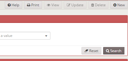
When the screen size is too small (mobile devices) the buttons defined on the buttons source of the screen are moved to the lower side:

XML skeleton
<button id="[button-identifier]" button-type="[button-type]" label="[button-label]" icon="[button-icon]"
        style="[button-style]" size="[button-size]">
  <button-action... />
  <dependency... />
</button>
Button structure
| Element | Use | Multiples instances | Description |
|---|---|---|---|
| button | Required | No | Global node of the button. Defines the button attributes |
| button-action | Optional | Yes | List of actions to be launched on button click |
| dependency | Optional | Yes | List of dependencies attached to the button |
Button attributes
| Attribute | Use | Type | Description | Values |
|---|---|---|---|---|
| id | Optional | String | Button identifier. For reference purposes | |
| label | Optional | String | Button text | Note: You can use i18n files (locales) |
| style | Optional | String | Button CSS classes | |
| icon | Optional | String | Icon identifier | Note: You can check all iconset at FontAwesome |
| button-type | Optional | String | Button default behaviour | button (default), submit or reset. See button types |
| size | Optional | String | Criterion size | sm (default), md or lg. |
| value | Optional | String | For setting one string value for button | |
| help-text | Optional | String | Help text to show in button as help | Note: You can use i18n files (locales) |
| help-image | Optional | String | Url image to show in button as help | Note: You can use i18n files (locales) |
Button types
| Type | Description | Image |
|---|---|---|
button | Standard button. Does nothing if there are no button actions attached |  |
submit | Submit button. Is called when a user presses INTRO inside a criterion |  |
reset | Reset button. If clicked launches a reset action |  |
Button events
| Event | Description |
|---|---|
click | Launched when an user clicks the button |
Button actions
Inside a button, you can define a list of button actions, which are actions that will be launched when the user pushes the button. The order of the button actions are defined is the same as they will be launched.
See the actions section for more details about actions.
Examples
Standard button with actions and dependencies (delete row in grid)
Button is disabled until at least one element is selected on the grid.
<button label="BUTTON_DELETE" icon="trash" id="ButDel">
<button-action type="check-some-selected" target="Grd..."/>
<button-action type="confirm" target="DelMsg" />
<button-action type="server" server-action="maintain" target-action="...Del"/>
<button-action type="filter" target="Grd..."/>
<dependency target-type="disable" initial="true">
<dependency-element id="Grd..." condition="<" value="1"/>
</dependency>
</button>
Button launched on click event
Same case as before, but activated with a dependency (and maybe with other element conditions)
<button label="BUTTON_DELETE" icon="trash" id="ButDel">
<dependency target-type="disable" initial="true">
<dependency-element id="Grd..." condition="<" value="1"/>
</dependency>
<dependency initial="true">
<dependency-element id="ButDel" event="click"/>
<dependency-element .../>
<dependency-action type="check-some-selected" target="Grd..."/>
<dependency-action type="confirm" target="DelMsg" />
<dependency-action type="server" server-action="maintain" target-action="...Del"/>
<dependency-action type="filter" target="Grd..."/>
</dependency>
</button>