Grids
Grids are the main component in AWE to show data lists. It is defined by grid and columns:
- The grid is the container of the data list. It has the query to load and a set of attributes to define the behaviour of the grid.
- Each column contains the source of the data from the data list, the label of the column and other attributes to manage each column cell.
There is also a group-header tag which is used to show a second level header over a group of column headers.

XML skeleton
To define a grid or a treegrid in AWE you must follow the next structure:
<grid id="[grid-identifier]" ...>
  <column ... ></column>
  ...
  <group-header ...>
    <column ...></column>
    ...
  </group-header>
  ...
  <button ... > ... </button>
  ...
  <context-button ...> ... </context button>
  ...
</grid>
Grid structure
<grid id="[grid-id]" style="[grid-style]"
      multiselect="[grid-is-multiselect]" checkbox-multiselect="[checkbox-multiselectable]" editable="[grid-is-editable]" send-operations="[grid-is-multioperation]" initial-load="[initial-load]" server-action="[server-action]" target-action="[target-action]" max="[elements-per-page] pagination-disabled="[pagination-disabled]"">
...
</grid>
General attributes
| Attribute | Use | Type | Description | Values |
|---|---|---|---|---|
| id | Required | String | Grid identifier. For reference purposes | |
| label | Optional | String | Grid title (For printing only) | Note: You can use i18n files (locales) |
| style | Optional | String | Grid CSS classes | |
| initial-load | Optional | String | Server action call to load the grid data. It only supports query value | |
| server-action | Optional | String | Server action call | See server action list |
| target-action | Optional | String | Target to call on the server | |
| max | Optional | Integer | Maximum number of elements to retrieve per page | |
| pagination-disabled | Optional | Boolean | Disabled the pagination element of grid | Note: Default value false |
| pager-values | Optional | String | Enable grid pager. Set the value list with the number of rows per page | Example: pager-value="5,25,50,100" |
| load-all | Optional | Boolean | Load all values of the grid and sort and paginate locally | Note: Default value is false |
| send-all | Optional | Boolean | Send all values of the grid to the server instead of selected ones. (Selected ones will be sent on .selected parameter) | Note: Default value is false |
| help | Optional | String | Help text for the grid | Note: You can use i18n files (locales) |
| help-image | Optional | String | Help image for the grid | This must be a image path |
| icon-loading | Optional | String | Set the loading icon | spinner (default), square, circles, carpet, dots, folding, squarebar, circlebar, cubes, icon, custom, none |
Column structure
<column label="[column-label]" name="[column-name]" sort-field="[sort-field]" align="[text-align]"
        charlength="[column-width-chars]" component="[column-component]" >
  <dependency ...> ... </dependency>
  ...
</column>
Column attributes
| Attribute | Use | Type | Description | Values |
|---|---|---|---|---|
| name | Required | String | Column identifier. For reference purposes | |
| sort-field | Optional | String | Sort field to sort by (if not treegrid) | |
| type | Optional | String | Field type (for printing purposes) | string, integer, float or date |
| hidden | Optional | Boolean | Column is not visible | Default value is false |
| align | Optional | String | Column is not visible | left, center or right |
| width | Optional | Integer | Column width in pixels | |
| sortable | Optional | Boolean | Field is sortable (if not treegrid) | Default value is true |
| movable | Optional | Boolean | Allows to move column position in the grid | Default value is true |
| sendable | Optional | Boolean | Column data must be sent to the server | Default value is true |
| charlength | Optional | Integer | Column width in chars | |
| label | Optional | String | Column label | Note: You can use i18n files (locales) |
| style | Optional | String | Column css class | Css class to apply to the column |
| component | Optional | String | Column type (if editable) | See components |
| max | Optional | Integer | Max number of records to retrieve when the column is initialized with target-action | Default value is 30 |
| visibility | Optional | Boolean | Initial visibility of the column component | Default value is true |
| frozen | Optional | Boolean | Keep the column fixed out of the horizontal scroll. WARNING: Don't use this attribute if header has more than one line height | Default value is false |
| excel-print-format | Optional | String | When printing to excel, if we want to print the cells as number, we need to use this attribute and set its value as "numeric". NOTE: If the column has a "numeric" component, it is not needed to define this attribute to print the cells as numbers |
Note: When a column is editable (it has a component) all attributes of criteria can be used in the column. See criteria attributes for more references.
Column components
| Component | Description |
|---|---|
| text | Text column component. See text criterion |
| password | Password column component. See password criterion |
| textarea | Textarea column component. See textarea criterion |
| numeric | Numeric column component. See numeric criterion |
| date | Date column component. See date criterion |
| time | Time column component. See time criterion |
| filtered-date | Filtered date column component. See filtered date criterion |
| select | Select column component. See select criterion |
| suggest | Suggest column component. See suggest criterion |
| select-multiple | Select multiple column component. See select multiple criterion |
| suggest-multiple | Suggest multiple column component. See suggest multiple criterion |
| checkbox | Checkbox column component. See checkbox criterion |
| color | Color column component. See color criterion |
| uploader | Uploader column component. See uploader criterion |
| text-view | Text view column component. See text view criterion |
| formatted-text | HTML Text column component. See formatted-text component |
| icon | Icon column component. Use it for showing font awesome icons in a column. |
| image | Image column component. Use it for showing images in a column. |
| button | Component which allows the user to click a button which launches a set of button-action |
| progress | Progress column component. Useful for showing a progress bar in a column. (Work in progress) |
| sparkline | Sparkline column component. Useful for showing a sparkline chart in a column. (Work in progress) |
Specific column components
There are several components developed specifically to be used in grid cells. These components need a special structure on the query which fills them:
<compound alias="specialCell">
  <computed alias="value" format="xxx"/>
  <computed alias="label" format="xxx" translate="EnumTranslate"/>
</compound>
These are the cells which use the special structure:
Standard cell without components
When you send a compound structure to a standard cell, you can use the following attributes:
| Attribute | Description |
|---|---|
| value | Value which will be sent to the server |
| label | Text which will be shown. You can use i18n files (locales) |
| title | Text to show when you move the mouse over the icon. You can use i18n files (locales) |
| cell-style | CSS class to format the contents |
Text view column component
This component is very useful to show an styled text inside a grid with an icon. The compound attributes to fill this component are the following:
| Attribute | Description |
|---|---|
| value | Value which will be sent to the server |
| label | Text which will be shown. You can use i18n files (locales) |
| title | Text to show when you move the mouse over the icon. You can use i18n files (locales) |
| icon | Icon class. You can check all iconset at FontAwesome |
| unit | Unit label (shown on the right of the cell). You can use i18n files (locales) |
| style | CSS class to format the contents |
Icon column component
This component is very useful to show an icon inside a grid. The compound attributes to fill this component are the following:
| Attribute | Description |
|---|---|
| value | Value which will be sent to the server |
| label | Text to show when you move the mouse over the icon. You can use i18n files (locales) |
| title | Text to show when you move the mouse over the icon. You can use i18n files (locales) |
| icon | Icon class. You can check all iconset at FontAwesome |
| style | CSS class to format the contents |
Formatted text column component
This component is used to show HTML code inside a grid. There are two type of HTML tags allowed:
<format style="[text class]">: Formatted text.<br>: New line
Image column component

This component is used to show an image inside a grid. The compound attributes to fill this component are the following:
| Attribute | Description |
|---|---|
| value | Value which will be sent to the server |
| label | Alternate text. You can use i18n files (locales) |
| title | Text to show when you move the mouse over the icon. You can use i18n files (locales) |
| image | Image path |
| style | CSS class to format the contents |
Button column component
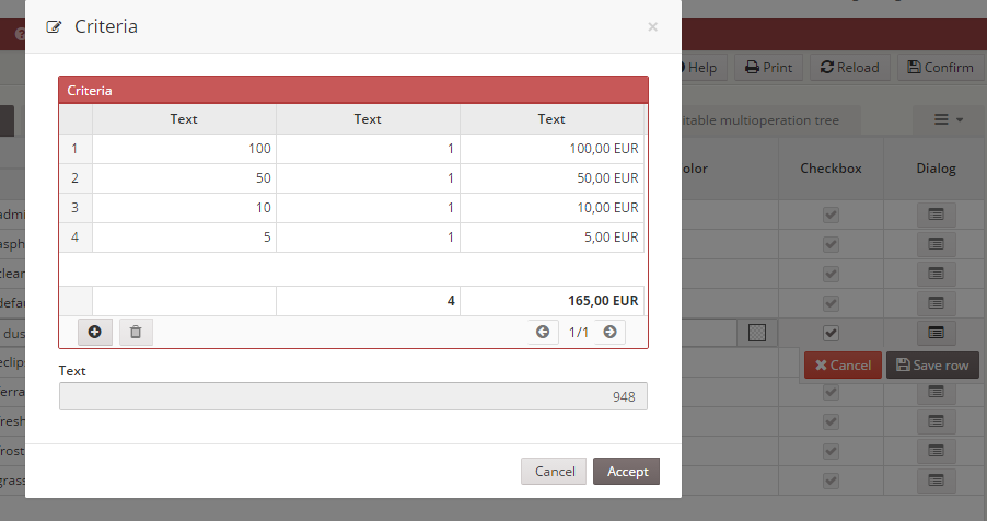
A button column is a component which allows to launch a set of button-action defined on column.
| Attribute | Description |
|---|---|
| value | Value which will be sent to the server |
| label | Text to show in the button. You can use i18n files (locales) |
| title | Text to show when you move the mouse over the button. You can use i18n files (locales) |
| icon | Icon class to show in the button. You can check all iconset at FontAwesome |
| style | CSS class to format the contents |
Progress column component

The progress component is very useful to show the status of a job, or a task.
| Attribute | Description |
|---|---|
| value | Value (in percentage (0-100) of the progress bar |
| label | Text to show in the progress bar (ie percentage) |
| title | Text to show when you move the mouse over the button. You can use i18n files (locales) |
| style | CSS class to format the contents |
Sparkline column component
(Work in progress)
Group header structure
<group-header label="[group-header-label]" name="[group-header-name]">
  <column...> ... </column>
  ...
</group-header>

Group header attributes
| Attribute | Use | Type | Description | Values |
|---|---|---|---|---|
| name | Required | String | Group header identifier. For reference purposes | |
| label | Optional | String | Group header label | Note: You can use i18n files (locales) |
Basic grid
The basic grid is the standard grid without a tree structure. It can be defined as single-select grid, multiselect grid, editable grid or multi-option grid, and combinations between them.
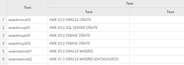
Basic grid specific attributes
| Attribute | Type | Description | Values |
|---|---|---|---|
| show-totals | Boolean | Show a line with totalizers | Default value is false |
| row-numbers | Boolean | Show the row numbers | Default value is false |
Multiselect grid
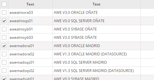
Multiselect grid specific attributes
| Attribute | Type | Description | Values |
|---|---|---|---|
| multiselect | Boolean | Allow selecting more than one line | Default value is false |
| checkbox-multiselect | Boolean | Allow selecting more than one line, but clicking only on the side checkboxes | Default value is false |
Tree grid
The tree grid is a grid that can be expanded as a tree. It can be defined as standard tree, loading tree, editable tree or multi-option tree, and combinations between them.
The data structure needs an identifier per row, and also a parent identifier, with no value if the row is a root row (with no parent). The identifier field must be defined on the grid tree-id attribute, and the parent must be defined on the tree-parent attribute.
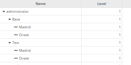
Tree grid specific attributes
| Attribute | Type | Description | Values |
|---|---|---|---|
| treegrid | Boolean | Set grid as treegrid | Default value is false |
| tree-id | String | Define identifier field | Default value is id |
| tree-parent | String | Define parent field | Default value is parent |
| tree-leaf | String | Define the 'is leaf' field | Default value is isLeaf |
| expand-column | String | Name of the column to be expanded | Must be a column identifier |
| initial-level | Integer | Initial level to expand | Default value is 1 |
| icon-expand | String | Icon of a branch without expand | Note: You can check all iconset at FontAwesome |
| icon-collapse | String | Icon of a expanded branch | Note: You can check all iconset at FontAwesome |
| icon-leaf | String | Icon of a leaf branch | Note: You can check all iconset at FontAwesome |
Editable grid

Editable grid specific attributes
| Attribute | Type | Description | Values |
|---|---|---|---|
| editable | Boolean | Allow editing the grid rows | Default value is false |
Multioption grid
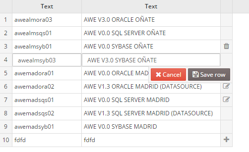
Note: The multioption grid will send a variable called
[GridId]-RowTyp(where[GridId]is the identifier of the grid) containing the action done in each row (INSERT,UPDATEorDELETEactions)
Multioption grid specific attributes
| Attribute | Type | Description | Values |
|---|---|---|---|
| send-operations | Boolean | Allow editing the grid rows, but sending only the modified lines | Default value is false |
Grid buttons
You can add button elements to perform actions over the grids. For instance, a pair of buttons to insert and delete rows.
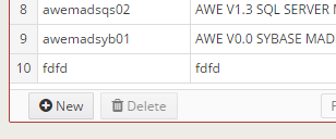
<grid id="GrdKeyLst" style="expand" initial-load="query" server-action="data" target-action="AweKeyLst" send-operations="true" editable="true" max="40">
  <column label="COLUMN_NAM" name="KeyNam" sort-field="KeyNam" align="left" charlength="20" component="text" validation="required">
    <dependency source-type="query" server-action="unique" target-action="AweKeyUni">
      <dependency-element id="GrdKeyLst" column="KeyNam" attribute="currentRowValue" />
    </dependency>
  </column>
  ...
  <button label="BUTTON_NEW" icon="plus-circle" id="ButGrdKeyLstAdd">
    <button-action type="add-row" target="GrdKeyLst" silent="true" />
  </button>
  <button label="BUTTON_DELETE" icon="trash" id="ButGrdKeyLstDel">
    <button-action type="delete-row" target="GrdKeyLst" silent="true" />
    <dependency target-type="enable" initial="true">
      <dependency-element id="GrdKeyLst" attribute="selectedRows" condition="==" value="1" />
    </dependency>
  </button>
</grid>
Context menu
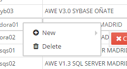
You can define a context-menu inside the grid to help the user do actions with the selected rows. See context menu.
Variables
The grid component sends some specific variables to the server, depending on its status and attributes. Here is the list of variables that can be sent by the grid component:
| Variable | Type | Condition | Description |
|---|---|---|---|
| [GridName] | Array | Always | List of selected lines identifiers |
| [ColumnName] | Array | send-all="false" | List of selected lines column values (for each column) |
| [ColumnName] | Array | send-all="true" | List of all column values (for each column) |
| [ColumnName].selected | Value/Array | Always | List of selected lines column values (for each column). If there is only one row selected, it will send only the value instead of an array |
| selectedRowAddress | JsonNode | When there is only one line selected | Json node with the address of the selected row: view, component and row id |
| sort | Array | Always | List of JsonNodes with the grid sort information (id: column id, direction: sort direction) |
| [GridName].data | JsonNode | Always | List of grid extra information (page, max records, sort information, etc) |
The multioperation grid sends the variables in a different way than the other grids:
| Variable | Type | Condition | Description |
|---|---|---|---|
| [GridName] | Integer | multioperation="true" | Number of sent operations |
| [GridName].RowTyp | Array | multioperation="true" | List of operations required for each column (only for the rows with operations) |
| [GridName]-id | Array | multioperation="true" | List of row identifiers for rows with operations |
| [ColumnName] | Array | multioperation="true" | List of column values for rows with operations (for each column) |
| [ColumnName].selected | Value/Array | Always | List of selected lines column values (for each column). If there is only one row selected, it will send only the value instead of an array |
| selectedRowAddress | JsonNode | When there is only one line selected | Json node with the address of the selected row: view, component and row id |
| sort | Array | Always | List of JsonNodes with the grid sort information (id: column id, direction: sort direction) |
| [GridName].data | JsonNode | Always | List of grid extra information (page, max records, sort information, etc) |
Note: See samples of usages on Service Definition